Notes by Kip Hansen — August 11, 2024 — 800 words
I'm checking the New York Battery tide gauge to see if the water levels have returned to normal range – the water levels have been unusually high and inconsistent with the long term trend:

And, as we can see, the latest data is entirely consistent with the trend, as expected. There's a reason for the months-long spike. Readers who know more can tell us in the comments.
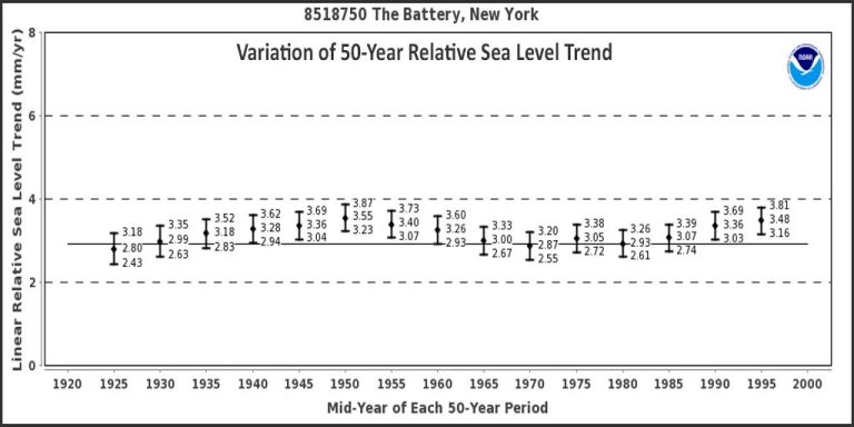
Since I was at the NOAA Tides and Currents site, I took a look at the rarely accessed repository view called “50-Year Relative Sea Level Trend Changes.” This is the battery:

Do you see that interesting wavy shape? I do.
What is this? The National Oceanic and Atmospheric Administration says:
“For sites with sufficient historical data, linear relative sea level trends were calculated in overlapping 50-year increments. Changes in each 50-year trend (with 95% confidence intervals) were plotted for mid-year during each 50-year period. The solid horizontal line represents the linear relative sea level trend throughout the record period.
Out of curiosity, I scrolled down and saw that NOAA provided the same view for 40 tide gauges across the United States.
The following are 12 works selected from the Northeast Coast of the United States, first presented in order as PowerPoint slides:

They all have the same/similar waveform, or segments of the waveform over a shorter period of time. How similar are they? let's see.
Put all 12 images together and align the vertical scale in millimeters:

Visually, we can see the waveform repeating at each meter. As we get closer to the present and more tide gauges are added to the mix, we see more changes.
Take another look:

In the image above, I aligned the “linear sea level trend using the entire recording period” for each gauge (the arrow points to the line).
In summary, we find significant similarities across the entire family of tide gauges.
The relative SLR ratios in the 1950s and 1960s were probably higher than what we have seen during the last 50 years.
It is also possible to chop off the earliest parts of the chart, leaving only the time period when the tide gauge records are shared with the satellite sea level measurement records. Doing so will produce a chart similar to this one from NASA:

The graph begins in 1993…and shows the tide gauge graph's upward trend over the last three 50-year periods. I've zoomed in on the lower right corner just because NASA drops the first few data points below zero and they are obscured by the white tick marks from 1993, which seems weird to me.
Remember, relative sea level rise is the sum of vertical land motion (VLM, where land moves up or down) and any change in the actual height of the sea surface (up or down). For tide gauges, measurements must be taken at the same location on the same structure (pier, dock, dock): sea surface height is measured by a modern tide gauge, VLM by a continuously operating GPS station connected to the same structure. NOAA attributes differences in RSLR rates to differences in VLM rates (in most cases, “negative VLM” or downward).
NASA explains the East Coast VLM in an article titled “America's Sinking East Coast.”
Yet, at the urging of major climate crisis advocacy organizations, the media feeds us stories like this:
Report finds Northeast could experience more than a century of sea level rise from 2000 to 2050
Federal report predicts sea level rise of one foot by 2050, with higher rises in Northeast
This is an interesting way to look at NOAA tide gauge records for the northeastern United States and the relative sea level rise rates shown therein.
######
Author comments:
What do you think about this? I'll try to find time to do the same for the West Coast and Gulf Coast. If I could find similar data for Europe and Asia.
NASA added the absolutely necessary “acceleration curve” as a thin red line. This line is entirely subjective, a matter of perspective and some fancy statistical trickery – which involves all the major mistakes in time series analysis – most importantly, using a very short time period, 30 years, to analyze a sustained phenomenon for centuries.
Tide gauge RSLR rate plots show cyclical patterns in rising rates – at least in the northeastern United States
Thank you for reading.
######
Relevant
